

The challenge was to create a cinema booking app that simplifies the user journey, enhances personalisation, and offers clear incentives for digital bookings. Currently their isn't enough incentive to use cinema booking app as oppose to in person.
To address this challenge, I followed the Empathize, Define, Ideate, Prototype, Test strategy. I wanted to tackle this by developing user flows which enabled users to book tickets as well as have an incentive to use the app.
I defined the target audience as people aged 18-55 , who lived in suburban areas but only go to the cinema a few times a year. All of them like going to the movies with someone else maybe friends or family.


I began with a short screener survey to identify users to interview. I received a variety of responses. of those responses, I could see that there were a number of features users would like to see. For example, easy seat selection, fast checkout, loyalty rewards/discounts and also group booking.

After analysing survey responses, I conducted five user interviews to gain deeper insights into their thoughts, feelings, and behaviors around cinema visits and ticketing apps. My goal was to uncover common frustrations and identify potential design opportunities.
Key Findings Personalisation is a must – Users dislike irrelevant movie recommendations.“I would love a personalised feature for a cinema ticket app! I hate it when it shows me horrors, and I hate horrors!”
Accessibility considerations – One user with epilepsy shared that the unpredictability of cinema environments (e.g., flashing lights in trailers) can make the experience nerve-racking.
Frustration with complex interfaces – Users felt current apps were cluttered and difficult to navigate, making booking a tedious process.
Lack of incentives to use apps – Many users preferred buying tickets in person unless they had a reason (like rewards) to use an app.
‘‘I don’t want something overly complicated. If the app is simple and easy to use, I’m more likely to use it regularly.’’
‘‘I think a point system would be good. It would make purchasing tickets worth it. I’m not overly bothered about going to the cinema as I can use apps like Netflix or whatever and watch from home. But introducing a reward/point system would more likely encourage me to go, if I know I’m getting more out of the experience.”
- User participants quotes.


I began with a short screener survey to identify users to interview. I received a variety of responses. Maicey is a 24-year-old insurance broker who leads a busy lifestyle, seeking a cinema ticket app that’s both quick and rewarding, with a focus on features like preference filters for a personalised experience. Hardeep, an IT technician with a family, also values a fast ticket-booking process but is especially drawn to the idea of earning rewards, which would motivate him to use the app for family movie outings. Together, they both prioritise efficiency and the ability to gain benefits from their ticket purchases, making convenience and rewards the key drivers in their app usage.f those responses, I could see that there were a number of features users would like to see. For example, easy seat selection, fast checkout, loyalty rewards/discounts and also group booking.
Using FigJam, I created empathy maps for Maicey’s persona, focusing on the full range of the user experience she would experience when ordering through a cinema ticketing app, to further empathise with my persona.

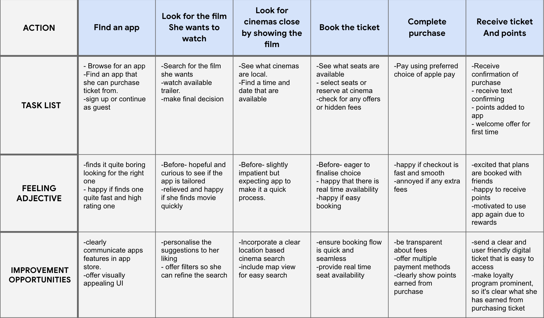
I then created user journey maps for each persona and developed problem statements for each.Maicey, a busy 24-year-old insurance broker, loves socialising with friends and going to the cinema. She needs a fast, user-friendly app to book tickets quickly, along with a preferences filter to avoid films that don’t interest her. Additionally, she would appreciate an incentive to use the app regularly, such as a rewards system.Hardeep, a busy IT technician and family man, needs an app that lets him book cinema tickets quickly and efficiently for family movie outings. He’s especially motivated by the ability to earn rewards, which would cause regular use of the app. Convenience and a seamless reward system are key to making the experience worthwhile for him and his family.
Our Spotlight app, will let users book films seamlessly and efficiently, whilst being able to earn&redeem rewards. By offering personalised incentives, we provide users with a compelling reason to choose our app, enhancing their overall cinema experience.
The next step in my process was to conduct a competitive analysis, focusing on both direct and indirect competitors for my cinema ticketing rewards app. For direct competitors, I selected Vue, Cineworld, and AMC; for indirect competitors, I chose O2 Priority and Dice. To thoroughly understand each app, I downloaded and tested them myself, applying a problem scenario similar to that of my user persona to evaluate how each app addressed user needs relative to my own.For each competitor, I examined and documented key aspects such as the desktop and mobile experience, accessibility, user flow, navigation, features, tone of voice, brand identity, and the feedback in positive and negative reviews. This analysis revealed several gaps and opportunities, providing valuable insights to better inform my app design.
I created a sample user flow that outlines the journey of a first-time user exploring the cinema ticketing app. The user navigates through the app's various features, including membership options, available rewards, and cinema listings. The flow showcases how the app introduces its key functionalities, guiding the user from initial discovery to making informed decisions about membership and rewards while also learning how to book tickets.

After reviewing my user flow, I found that adopting a Hub & Spoke style IA would be a great fit for my app. I wanted the home screen to serve as the central hub, offering users easy access to key areas like viewing rewards and browsing films.

After reviewing my user flow, I found that adopting a Hub & Spoke style IA would be a great fit for my app. I wanI started by sketching my app screens with pencil and paper, allowing me to quickly experiment with layouts and visualizing features. I continued using this technique throughout the prototyping phase, even when transitioning to digital wireframes. This hands-on approach helped me instantly assess whether certain ideas worked, and it encouraged me to explore new concepts as they came up.ted the home screen to serve as the central hub, offering users easy access to key areas like viewing rewards and browsing films.


After creating the initial sketch wireframes, I transitioned them into digital wireframes using Figma to refine the design of my cinema ticketing and rewards app. I adopted a hub-and-spoke style architecture with hierarchal elements , which allowed me to organise the main navigation and sub-sections in a way that felt intuitive for users. This approach ensured that all key features like movie browsing, ticket booking, and rewards were easily accessible while maintaining a clean, structured layout.

.png)
.png)